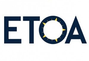
 ETOA’s enhanced visual identity reflects its leading role within the European tourism industry and its spirit of cooperation.
The new brand recognises the fundamental elements of the organisation’s original image, retaining the colours and reference to the stars and colour of the European Union; however the new independent graphic device is now flexible enough to be locked up with another partner logo and used by members. The new logo was designed for optimal display on the clean backgrounds of digital spaces – now a must for all brands; unlike in 1989 when ETOA was founded.
The creation of new visual identity looks forward to yet another record breaking year. The refresh comes at a time when the European tourism association want to reflect its modern membership, now spanning sectors including buyers from traditional operators to online wholesalers and tourism product from across Europe, including accommodation, attractions, transportation, performing arts, culture, heritage and digital services.
Avoiding a complete overhaul of all its visual assets, ETOA has sought to update the look, tone, feel of its previous image, reflecting the organisation’s dynamic constitution and the ever evolving breadth of its membership.
Martine Ainsworth-Wells, Director of Marketing & Commerce said: “I was keen to ensure that we didn’t lose the strengths of our original brand – our European status, our history, credibility and reputation. We have created a refreshed identity that is modern, bright and fit for purpose in the digital era. It offers an added visual illusion to viewers: is the graphic devise a compass, the sun or a star? All are travel related icons and as such, the device is whatever the viewer wants it to be. This truly reflects our organisation’s flexibility, diverse offer and ability to serve our members needs now and in the future to ensure their economic well-being and that of Europe”.


